
Ultimate LinkedIn Banner Ideas to Transform Your Professional Brand
Most LinkedIn profiles fail to utilize banner space effectively, limiting visibility and brand recall. A well-designed header builds credibility. Platforms like Zawa facilitate the production of polished, high-quality visuals efficiently.


Scroll through LinkedIn for five minutes and you will notice something. Most banners are either grey placeholders or random stock images. Neither tells you anything about the person. That space at the top of every profile is free, large, and almost always wasted.
Recruiters, clients, and collaborators all land on your profile. They form an impression fast. Your banner is part of that impression whether you designed it or not. This guide breaks down LinkedIn banner ideas by use case, covers what makes a design actually work, and shows how Zawa makes the whole thing faster.
What Is a LinkedIn Banner?
It is the wide horizontal image behind your profile photo. LinkedIn profile banners use a 4:1 aspect ratio, with 1584 × 396 pixels commonly used as the standard display size. For sharper results on larger screens, many creators design at higher resolutions such as 2184 × 528 pixels while maintaining the same ratio. That is a lot of space. And yet most profiles leave it untouched.
When you do not upload anything, LinkedIn drops in a flat grey background. That grey does not say anything bad about you. But it does say you have not thought about it. On a platform where professional presence matters, small signals add up.
A well-used banner can carry your job title, a tagline, your brand, or your work. That is a lot of value from an image most people skip.
Best LinkedIn Banner Ideas by Style and Theme
What works for a job seeker will not work for a design agency. The right banner depends on what your profile is trying to do. Here are the best LinkedIn banner ideas broken down by style and theme.
Minimalist LinkedIn Banner Ideas
Minimalist banners are one of the safest and most effective choices on LinkedIn. Clean backgrounds, limited color palettes, and simple layouts make profiles look more professional and modern.

Personal Branding LinkedIn Banner Ideas
If you are building a personal brand, your banner should quickly tell people who you are and what you do. You can also include your brand colors, social handles, creative niche, or even a personal photo to make your profile more memorable.
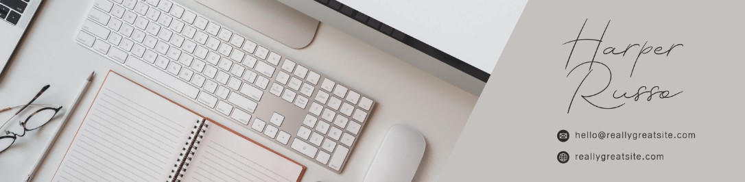
Workspace & Desk Setup Banner Ideas
Workspace-style banners are especially popular among freelancers, designers, developers, and remote workers. Laptops, coffee cups, and natural lighting help make the profile feel more authentic and work-focused while subtly communicating professionalism and productivity.
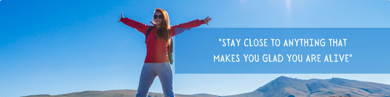
Quote-Based LinkedIn Banner Ideas
A strong quote or short statement can sometimes be more effective than a complex design. Many users place their personal philosophy, career goal, or industry perspective directly in the center of the banner. This type of banner works especially well for consultants, speakers, creators, and professionals building a strong personal identity.
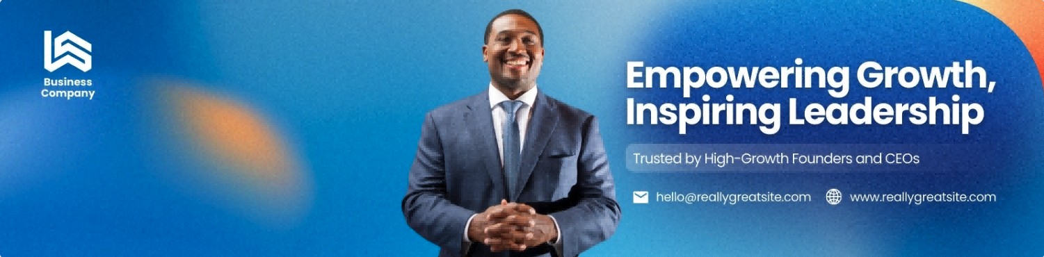
Corporate & Business LinkedIn Banner Ideas
Business-style banners are usually more formal and professional. Common elements include city skylines, office environments, professional portraits, and business color palettes such as dark blue, black, and white. These banners focus on building trust and creating a reliable first impression.
Note: Company page banners use different dimensions — 1128×191 pixels, not 1584×396. If you are creating a banner for a LinkedIn company page rather than a personal profile, design to this size before uploading.
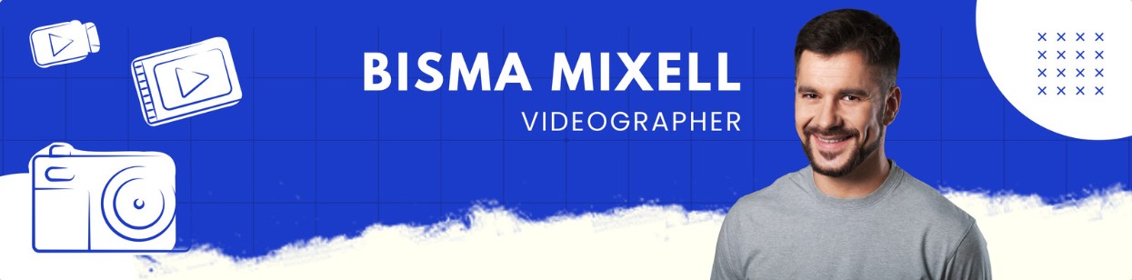
Creative LinkedIn Banner Ideas
experimental. For designers, photographers, video creators, and artists, the banner itself becomes part of the portfolio. Many visitors will immediately judge your visual style and creative ability based on this section alone.
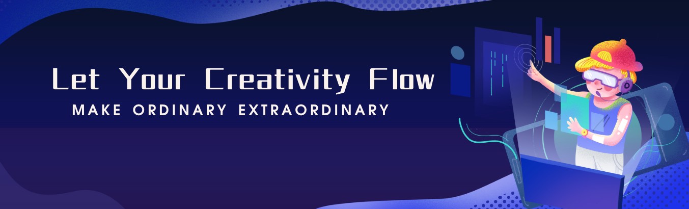
Modern & Cool LinkedIn Banner Ideas
Modern and cool LinkedIn banners often use clean layouts and futuristic visual styles to make profiles look more creative, current, and visually polished. This style is especially popular in AI, tech, startup, and digital industries because it helps strengthen both professionalism and personal branding.
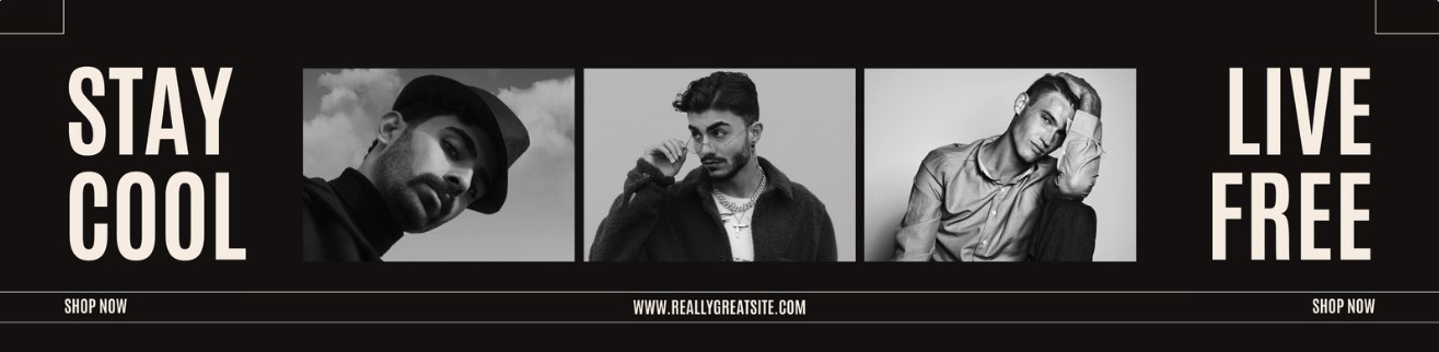
High-Impact LinkedIn Banner Strategy: Design, Visibility, and Performance
Picking the right idea is the first step. Making sure the design holds up technically is the second. Three things determine whether a banner actually performs.
Visual Hierarchy and Layout Clarity
Your most important element goes in the center or upper area of the banner. The lower-left corner is behind your profile photo on the desktop. Put anything important there and it disappears.
Use space. A banner that tries to fit too much in becomes unreadable. One main message with room around it will always outperform a crowded layout.
Color, Typography, and Branding Consistency
Two or three colors. That is the limit. Your banner palette should sit comfortably next to your profile photo, not clash with it. Cohesion across the top of your profile reads as professionalism.
Fonts matter too. Decorative scripts fall apart at small sizes. Bold, clean fonts hold up whether someone is on a desktop monitor or a phone screen. Use your branded fonts if you have them. If not, stick to something legible and neutral.
Banner Dimensions, Responsiveness, and Performance Optimization
LinkedIn profile banners use a 4:1 aspect ratio. While 1584 × 396 pixels is the standard display size, many designers create banners at higher resolutions such as 2184 × 528 pixels to improve clarity on larger and high-density displays.LinkedIn accepts JPG and PNG files up to 8 MB, and using the sRGB color profile can help prevent color shifts after upload. Because LinkedIn compresses uploaded images, starting with a high-quality source file generally produces better results. Export your banner before uploading and avoid unnecessarily scaling it down.
Mobile crops the left and right edges of the banner. A large chunk of your profile visitors are on phones. If your text or logo sits near the edges, test on a phone screen before publishing. Keep the key content in the center third of the image to stay safe.
Knowing the approach is one thing. Having a way to build it fast, without a design background, is another. That is what Zawa handles.
Zawa: Simplifying LinkedIn Banner Creation
Zawa is an AI-powered platform built for creating professional visual content without a design background. You put in your details - what you do, your brand colors, your message and it builds a polished banner from that. No design software to learn, no templates to wrestle with, no prior experience needed. The output comes out clean, properly sized, and ready to upload straight to LinkedIn.
Key Capabilities:
-
Generates banners from simple text inputs
-
Applies automatic visual enhancements for a cleaner result
-
No design skills needed
-
Adjustments and regeneration take seconds
How to Create LinkedIn Banner Ideas Using Zawa
Before opening any design tool, write down what this banner is supposed to do. Attract clients, signal availability, push a product, reinforce a brand name. Pick one. Trying to cover multiple goals at once usually produces something vague that covers none of them well.
Step 1: Plan the Design Direction
What works visually in one field often looks wrong in another. The aesthetic that fits a freelance illustrator does not belong on a corporate consultant's page, and mixing them up sends mixed signals to the right audience. Brand colors are the easiest starting point if you have them. If not, pick two or three that feel consistent with the industry and move on.
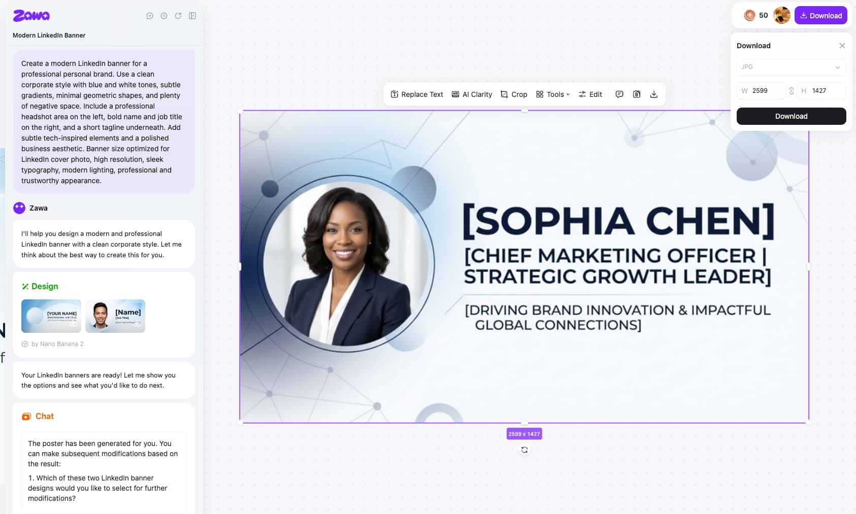
Prompt input: Create a modern LinkedIn banner for a professional personal brand. Use a clean corporate style with blue and white tones, subtle gradients, minimal geometric shapes, and plenty of negative space. Include a professional headshot area on the left, bold name and job title on the right, and a short tagline underneath. Add subtle tech-inspired elements and a polished business aesthetic. Banner size optimized for LinkedIn cover photo, high resolution, sleek typography, modern lighting, professional and trustworthy appearance.
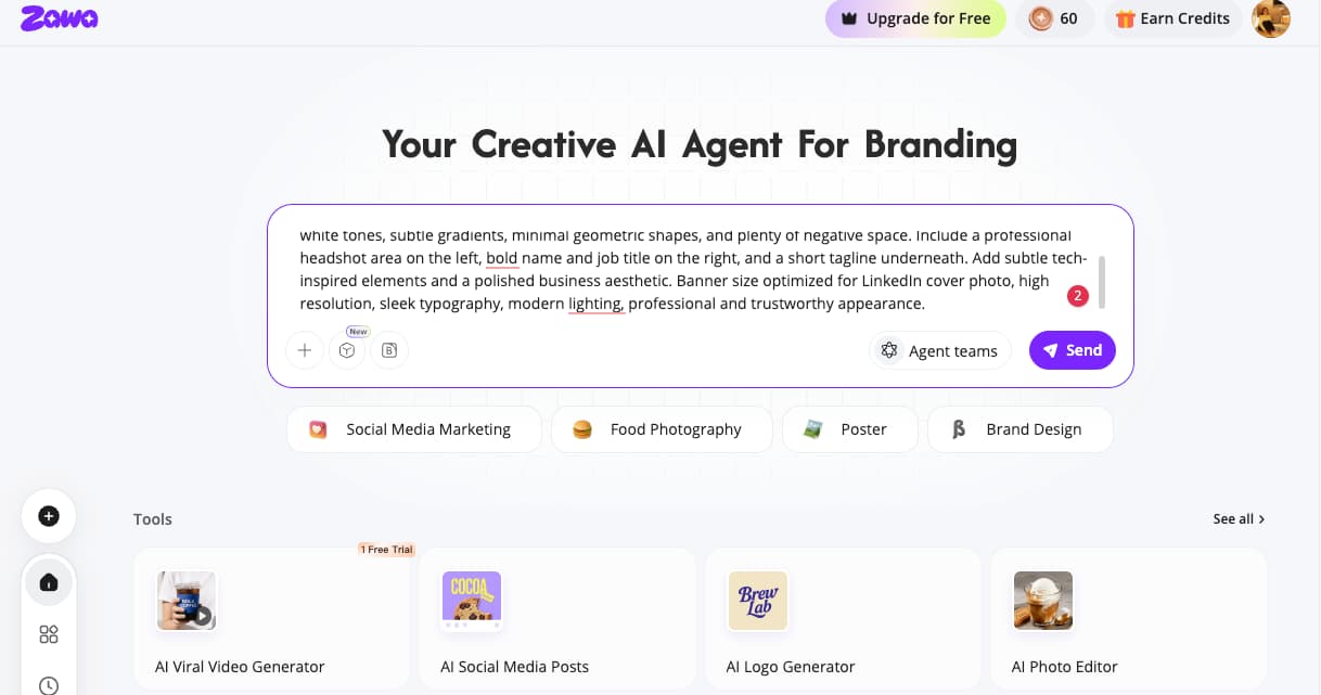
Step 2: Create and Refine
Type your details into Zawa. The platform builds the first version of what you give it. From there, edit image: layout, text placement, colors. Generating a new version takes seconds, so there's no reason to publish something that feels close but not quite right.
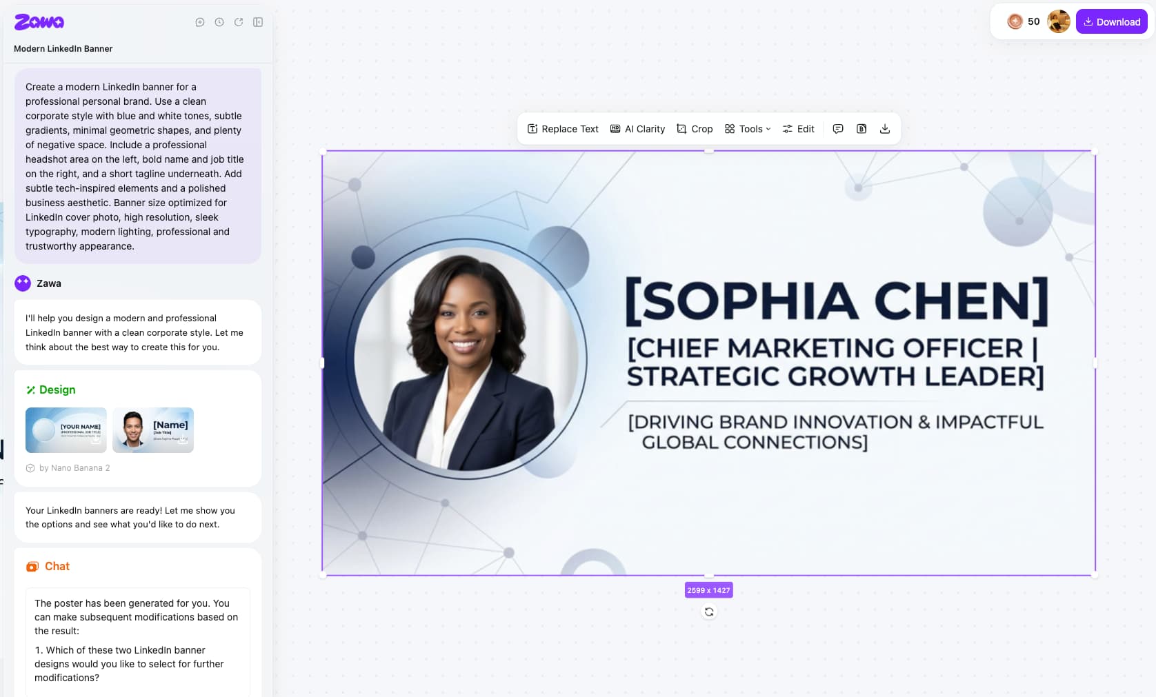
Step 3: Download and Upload
Before uploading, keep the banner at a 4:1 ratio. While 1584 × 396 pixels is the standard display size, exporting at 2184 × 528 pixels usually delivers better clarity on larger screens.Then open LinkedIn on your phone and look at the actual result on a small screen, not just on your desktop where everything looks fine. Update the banner whenever your situation shifts. A stale banner sitting on an otherwise current profile sends a small but real signal that something has been neglected.
Best Practices for Creating Top LinkedIn Banner Ideas
Define clear goals aligned with profile identity
Knowing what you want people to do when they land on your profile changes every design decision. A B2B provider isn't trying to talk to the same person as a fresh grad or a freelancer hunting project work. When the banner tries to cover all of that, it ends up saying nothing memorable. Pick your audience, design for them, and leave everyone else out.
High-quality visuals and a clean layout for easy scanning
A blurry image or a packed layout both say the same thing without meaning to: this wasn't a priority. Good contrast does most of the work here — when text reads easily against the background, the message gets through before the visitor even decides whether they're interested. People aren't studying your profile. They're glancing at it. The banner either lands in that glance or it doesn't.
Consistency across profile elements and guiding attention
The banner, profile photo, and headline are all in view at the same time. Visitors take them in together, not one at a time. When those three elements have mismatched colors or conflicting tones, the page looks like it was put together in pieces rather than as a whole.
Include keywords in your banner text for search visibility
LinkedIn's search algorithm reads text elements in your banner. A job seeker whose banner includes specific skill terms — "UX Designer" or "Data Analyst" — surfaces more easily when recruiters filter by those terms. You do not need to make the keywords prominent — a clean tagline that describes what you do specifically handles both the design and the discoverability.
There's a small but useful design detail related to your profile photo. People's eyes naturally follow wherever the subject in a photo is looking. If your headshot faces right, viewers tend to look right. Putting the banner's most important text on that side quietly guides attention where you want it.
Critical Mistakes That Weaken LinkedIn Banner Impact
Overloading the banner reduces clarity
Pack too much into the banner and it starts working against you. Three fonts, five colors, a logo, a tagline, and something else competing for attention: none of it lands. People skip crowded banners the way they skip banner ads. Leaving room around a single clear message is not lazy design. It is usually what makes the thing readable.
Using generic visuals weakens professional positioning
City skylines, blurred office shots, and template gradients are everywhere on LinkedIn. Nobody stops for them. They fade into the background because they carry no specific information about who you are. Even a simple, specific image that connects to your actual work registers differently than a stock visual that could belong to any profile in any industry.
Ignoring spacing and mobile responsiveness leads to poor visibility
On mobile, LinkedIn cuts into both sides of the banner. Designers who only check their work on a desktop often publish without realizing this, and the result is logos or text near the edges that a large portion of visitors never actually see. Keep everything that matters in the center third. Looking at it on a phone before publishing takes thirty seconds and prevents a problem that is easy to miss otherwise.
Conclusion
LinkedIn banner ideas are not one thing. What a student needs from the banner has nothing to do with what a company page needs. The goals differ, the audiences differ, and the design should reflect that. What stays consistent underneath all of it: a focused message, visuals that actually connect to the brand, and a layout that works on any screen size.
For most people, the blockers are straightforward. No design background. Not enough time. No clear idea where to start. Zawa removes those blockers. It produces a professional LinkedIn banner from simple inputs, fast, and without needing any prior experience.
Try Zawa today and see what a strong LinkedIn banner actually looks like on your profile.
Frequently Asked Questions
What are the best LinkedIn banner ideas for professionals?
Keep it simple. Your role, a short tagline, and a couple of brand colors get you most of the way there. Don't cram in extra information thinking it adds value, it usually just makes the thing harder to read. The banner should back up your headline, not compete with it.
What size should a LinkedIn banner be?
1584 × 396 pixels is the standard LinkedIn banner size, but many designers recommend exporting at 2184 × 528 pixels for better image quality and clarity on larger screens. LinkedIn will compress your image after uploading regardless, so start with the highest quality file you have. A sharp source file survives compression better than a small one. The difference is noticeable when you put them side by side.
How often should a LinkedIn banner be updated?
When something actually changes-new role, new offer, rebrand, launch. If nothing major has shifted, a quick check once a year is fine. An old banner isn't a crisis, but if someone lands on your profile and notices it feels dated, that's a small thing that didn't need to be there.
Can AI tools help create LinkedIn banners?
Yes. Zawa takes your input and produces a professional banner without you needing any design experience. Layout, formatting, visual quality — it handles all of it. What used to take hours of back-and-forth in a design tool now takes a few minutes.
What are common LinkedIn banner mistakes?
Leaving the default grey background. Text sitting too close to the edges where mobile crops it. Too many fonts or colors fighting for attention. Stock images that could belong to anyone. These aren't complicated problems — they just need to be caught before you hit publish.
Which tools are useful for banner creation?
Zawa is the go-to if you want a professional result without the design work. Canva is fine for template-based editing if you prefer more hands-on control. Adobe Express works for users with some design background. For most people, Zawa gets you there faster.
You May Be Interested
LinkedIn Ad Specs 2026: Complete Guide for All Ad Formats
How to Post a Carousel on Facebook: The Right Ways in 2026
How to Make Money on Instagram Reels in 2026
How to Photograph Clothing for E-commerce and Creative Use

140+ Facebook Bio Ideas: Short, Professional, Unique, and More
