
Best Fonts for YouTube Thumbnails That Actually Get Clicks
A great video can get lost if your text is hard to read. Discover the 13 best fonts for YouTube thumbnails in 2026 to instantly boost your CTR. We cover top typography for every niche, pro design tips, and common mistakes that kill views.

YouTube gets over 500 hours of new video every single minute. You are competing against a massive crowd. When someone scrolls through their feed, you have about 1.5 seconds to catch their eye. Your thumbnail needs to trigger a click right away. Good typography does more than make an image look pretty. It actually plays a major role in driving your Click-Through Rate (CTR). Marketing data actually backs this up. Using bold, highly legible fonts can boost your CTR by up to 35%.
Below, we reveal the exact fonts top creators use. You will learn the top picks for every niche and design mistakes to avoid. Let's find the absolute best font for your YouTube thumbnail.
Why Does the Best Font for Your YouTube Thumbnail Matter?
Trying to pick the best font for YouTube thumbnail design might feel like a tiny detail. But on YouTube, it is actually a massive deal.
-
The 1.5-Second Rule
Viewers scroll through YouTube incredibly fast. You get roughly 1.5 seconds to catch their eye. Because of this tight window, your text must be easy to read right away. Nobody is going to stop and try to decode a fancy cursive font. If viewers cannot read your words instantly, they will just keep scrolling past your video.
-
Mobile Viewing Changes Everything
More than 70% of YouTube views come from mobile devices. Just think about how tiny a thumbnail gets on a phone screen. A font might look amazing on your giant computer monitor. But on an iPhone? It could easily turn into a messy blur. Making sure your text is readable on small screens is an absolute must.
-
Showing Off Your Channel's Vibe
Your font actually shows off your channel's personality before anyone even reads the words. A thick, rough font shows that a gaming video will be loud and high-energy. On the other hand, a clean, simple text style fits perfectly with luxury or lifestyle vlogs. The best fonts for YouTube thumbnail designs will always match the actual mood of your video.
-
Why Custom Thumbnails Win
YouTube's own data shows that 90% of the best-performing videos use custom thumbnails. You simply cannot rely on a random screenshot that YouTube picks for you. Designing your own image and adding custom text is a core step. It is the only real way to build a thumbnail that stands out against the competition.
-
Controlling Visual Hierarchy
Visual hierarchy is how you guide the viewer's eye. Font weight (how thick the letters are) and font size tell the viewer exactly where to look first. A heavy, bold font pulls the eye immediately. This allows you to highlight the most important hook of your video.
13 Best Fonts for YouTube Thumbnails in 2026
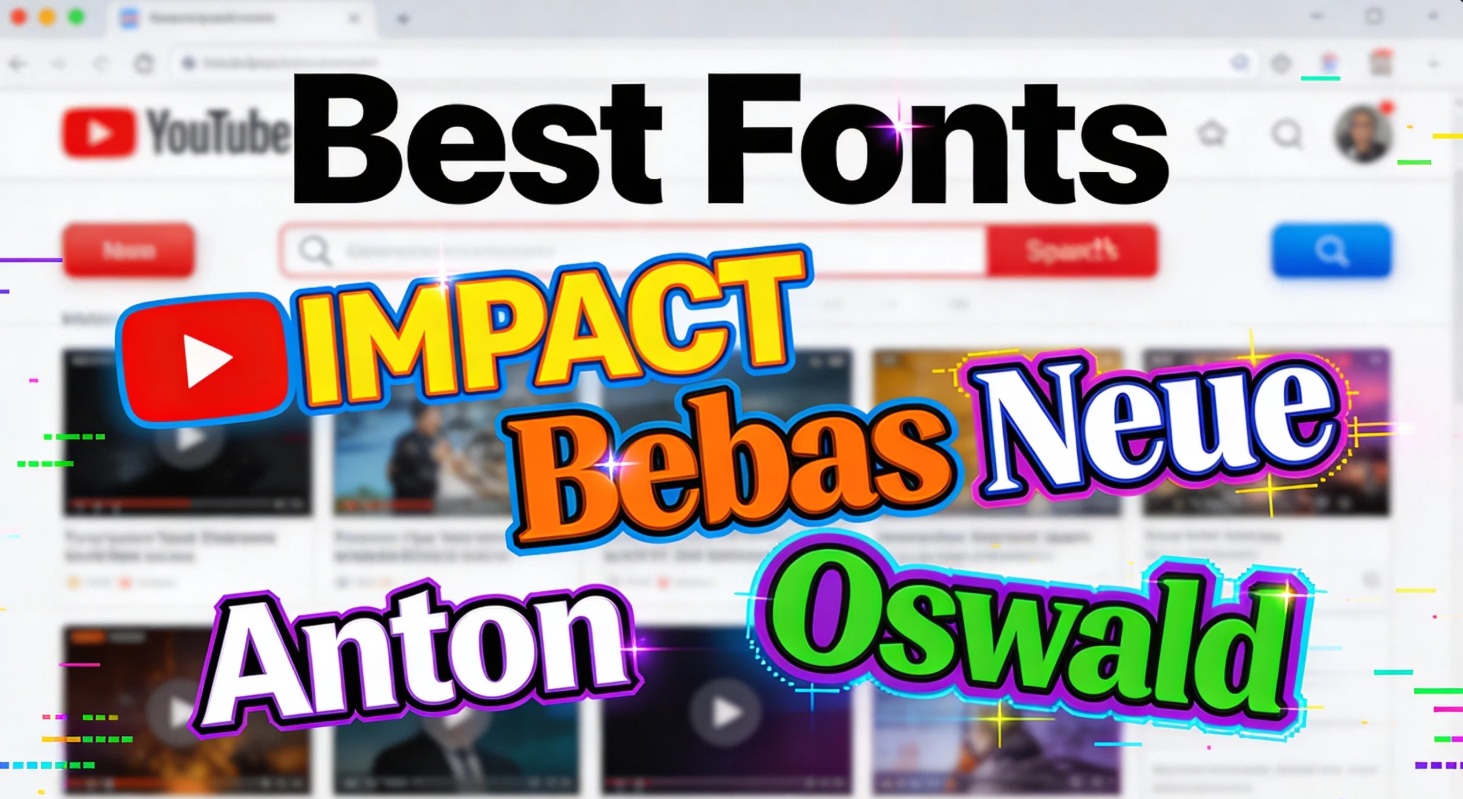
These fonts are free, proven, and used by top creators across every niche. Let's look at the top contenders for the best fonts for thumbnail YouTube success.
-
Bebas Neue
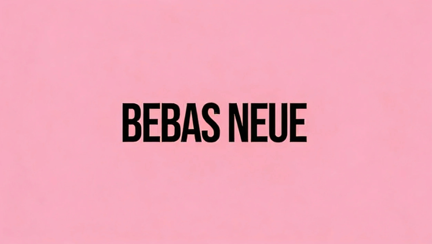
Bebas Neue is an all-caps, condensed sans-serif font. It is incredibly bold without being overwhelmingly loud. Because the letters are tall and narrow, you can fit larger words into a smaller horizontal space.
-
Best for: Gaming, tech reviews, reaction channels, and TOP 10 lists.
-
Used by: Linus Tech Tips, IGN, and Aspyn Ovard.
-
Availability: Free on Google Fonts.
-
Impact
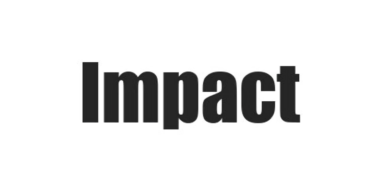
Impact is the classic, thick, ultra-bold sans-serif font. It is often considered the original thumbnail font. It has massive weight, which makes it pop off the screen effortlessly. It carries a very casual, internet-native vibe.
-
Best for: Reaction channels, comedy skits, challenges, and internet drama.
-
Used by: PewDiePie and virtually every creator during the meme era.
-
Availability: Pre-installed on most computer systems.
-
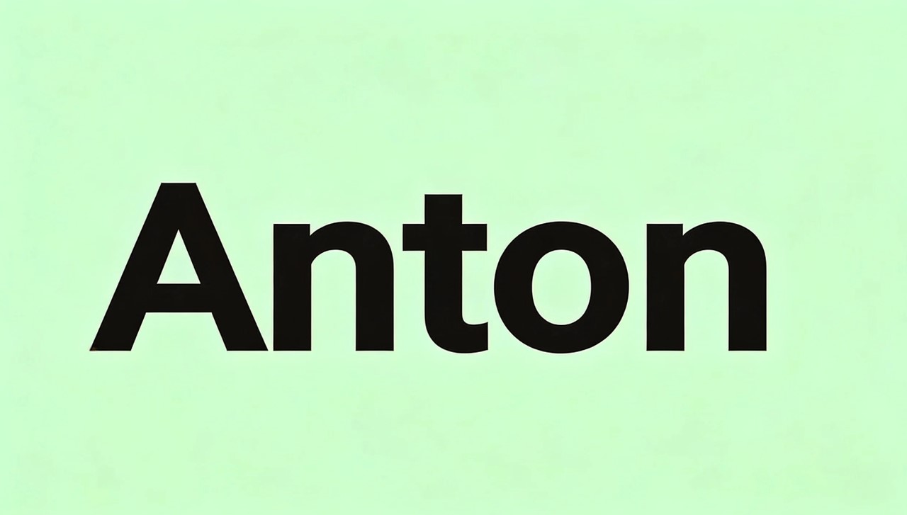
Anton
Think of Anton as Impact's more refined cousin. It is a thick, blocky font designed specifically to grab attention. It has a slightly more modern feel than Impact but delivers the same heavy punch.
-
Best for: Action-driven videos, sports highlights, and high-energy content.
-
Used by: Linus Tech Tips for their punch-heavy, dramatic thumbnails.
-
Availability: Free on Google Fonts.
-
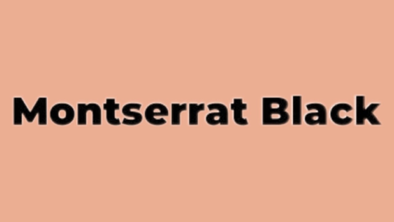
Montserrat (Bold/Extra Bold)
Montserrat is a geometric, clean, and modern sans-serif. It is easily the most versatile option on this list. It looks professional but friendly. You can use it at heavy weights for your main hook, and pair it with Montserrat Light for supporting text.
-
Best for: Lifestyle, travel vlogs, fashion, beauty, and general content.
-
Availability: Free on Google Fonts.
-
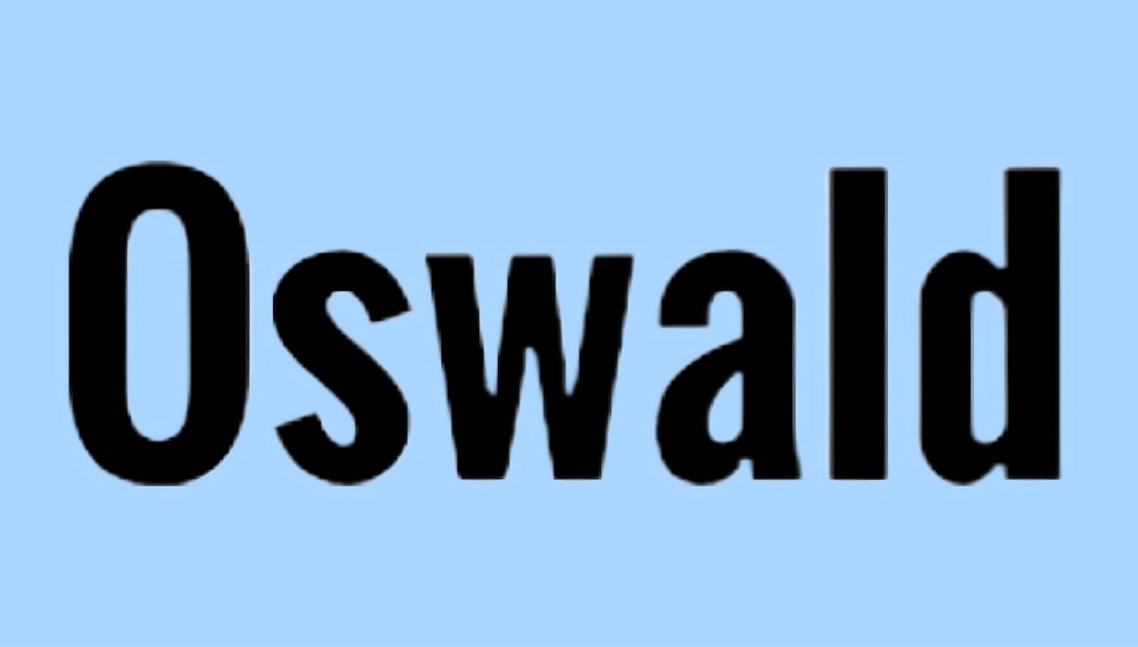
Oswald
Oswald is a condensed, modern sans-serif font. It looks very clean and highly professional. Because it is condensed, it saves space like Bebas Neue, but it has a slightly more premium, tech-focused feel.
-
Best for: Tech reviews, software tutorials, and analytical channels.
-
Used by: Marques Brownlee (MKBHD).
-
Availability: Free on Google Fonts.
-
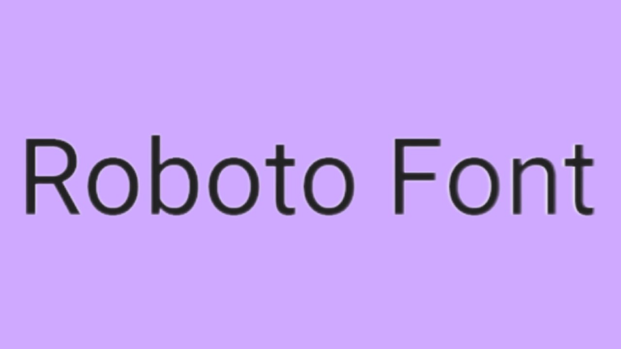
Roboto (Bold)
Roboto is a geometric sans-serif made specifically for digital screens. It was built so people can easily read it on any device. The letters have a clean and warm look. They are clear enough for anyone to read. Here is a great bonus. YouTube actually uses this exact font for its own interface. Because of that, your viewers will subconsciously feel familiar with your text right away.
-
Best for: Educational videos, informational guides, and business channels.
-
Availability: Free on Google Fonts.
-
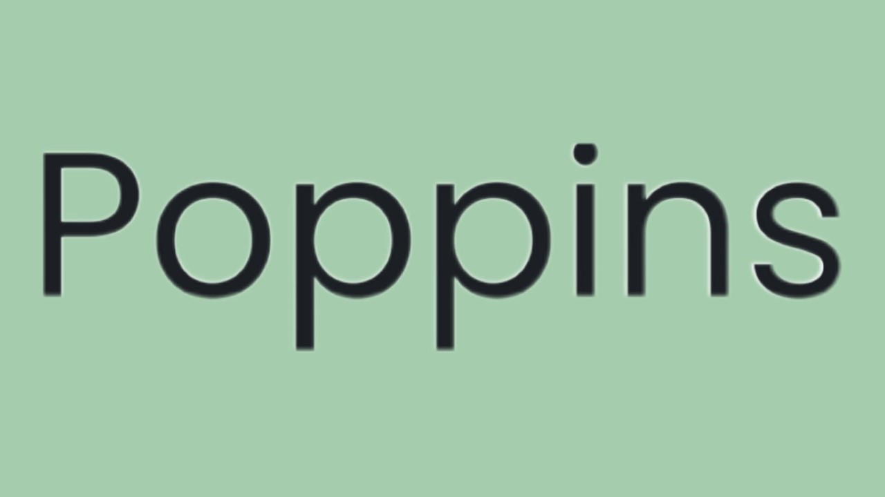
Poppins (Bold/SemiBold)
Poppins is a rounded geometric sans-serif font. The circular shapes of the letters make it feel very friendly, approachable, and clean. It has a massive range of weights, giving you a lot of design flexibility.
-
Best for: How-to tutorials, DIY projects, gaming, productivity, and educational vlogs.
-
Availability: Free on Google Fonts.
-
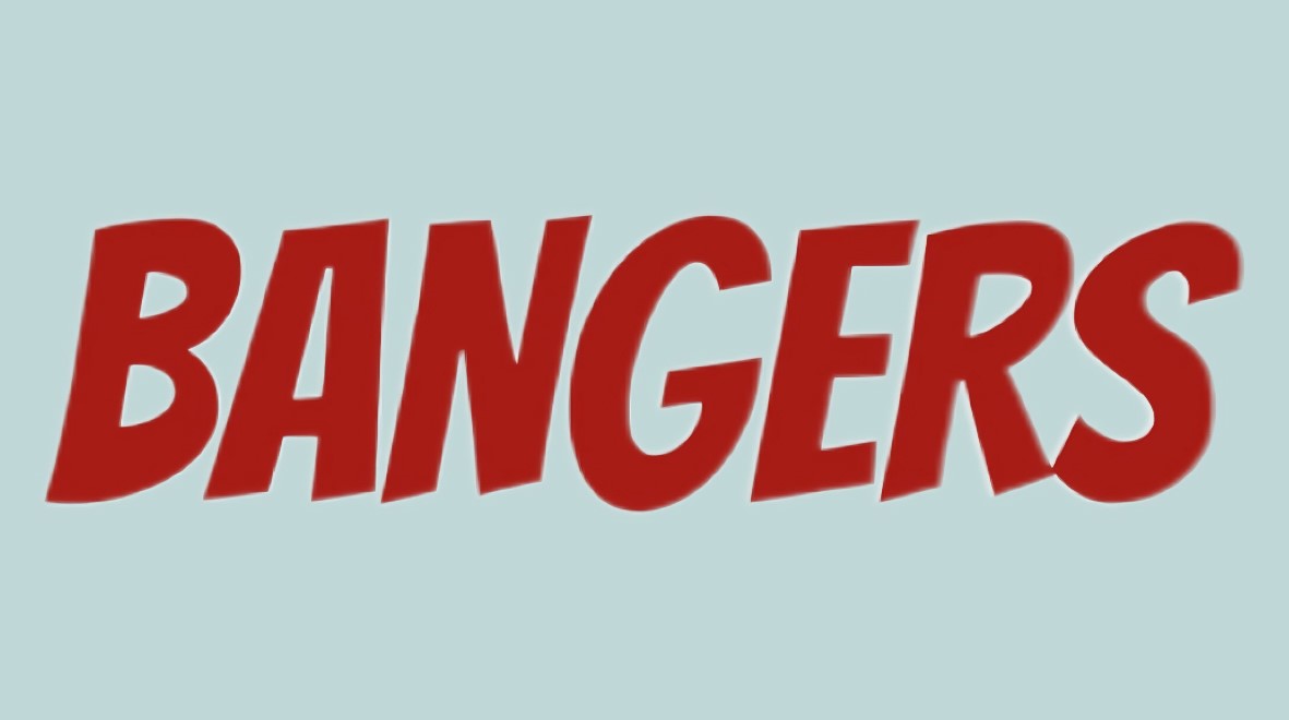
Bangers
Bangers is a comic-book style display font. It is loud, bold, and packed with energetic vibes. You should use this font sparingly because it has a very high personality. It only works if your channel matches that specific energy.
-
Best for: Extreme challenge videos, entertainment, animation, and drama.
-
Availability: Free on Google Fonts.
-
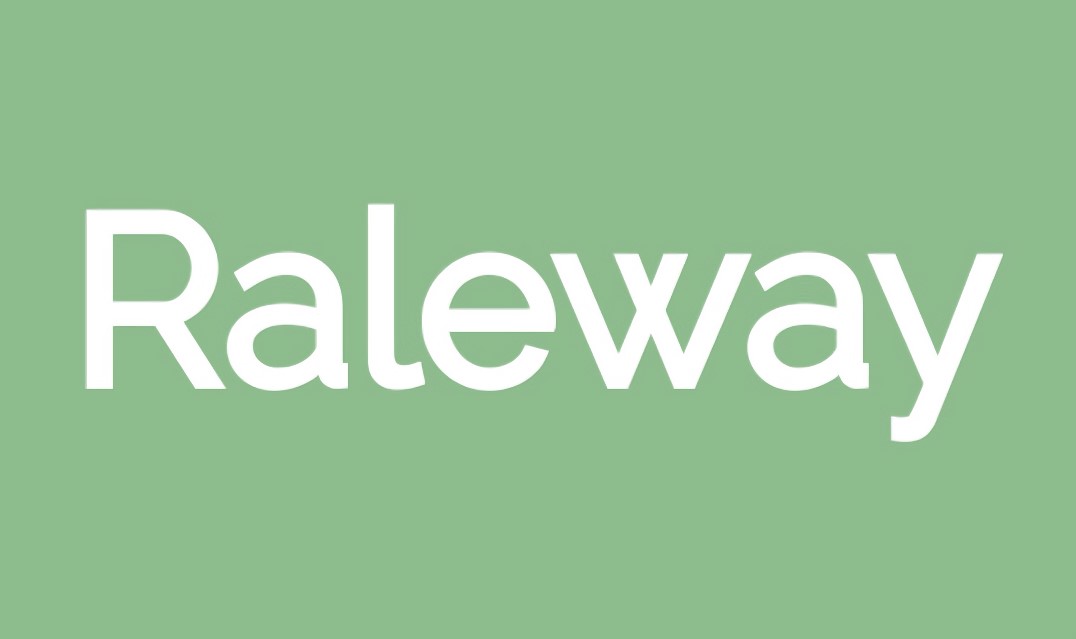
Raleway (Heavy)
Raleway is an elegant, refined sans-serif font. While it is often used for delicate designs, using the "Heavy" weight makes it perfect for thumbnails. It maintains its luxury feel while being thick enough to read on mobile.
-
Best for: Minimalist design, fashion, luxury reviews, and high-end lifestyle.
-
Used by: Thomas Frank for a consistent, professional look.
-
Availability: Free on Google Fonts.
-
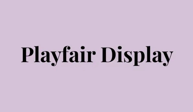
Playfair Display (Bold)
Playfair Display is a high-contrast serif font. Unlike most serif fonts (which have those little "feet" on the letters), Playfair Display actually works at thumbnail scale. The thick strokes keep it readable, bringing an element of elegance and sophistication.
-
Best for: Fashion, beauty, upscale cooking, storytelling, and luxury lifestyle.
-
Availability: Free on Google Fonts.
-
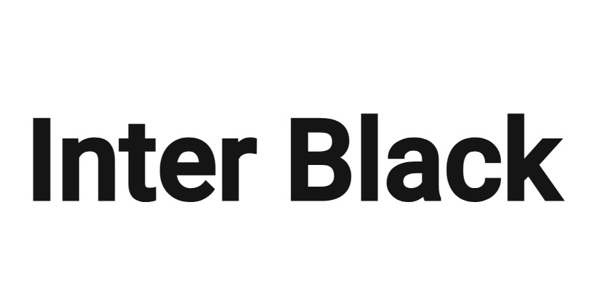
Inter (Bold)
Inter was meticulously designed for screen legibility. It is highly neutral, modern, and minimal. If you want your text to deliver information without adding any extra emotional "flavor," Inter is your best bet.
-
Best for: Tech, software development, coding tutorials, design, and productivity.
-
Availability: Free on Google Fonts.
-
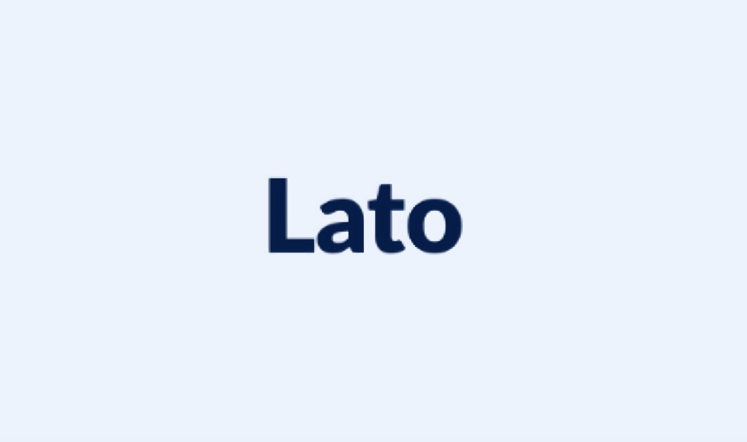
Lato (Black/Bold)
Lato is a semi-rounded, warm geometric sans-serif. It strikes a perfect balance. It looks professional, but it still feels highly approachable and human. It pairs perfectly with Lato Light if you need to establish a strong visual hierarchy.
-
Best for: Lifestyle vlogs, food and cooking, beauty, and family content.
-
Availability: Free on Google Fonts.
-
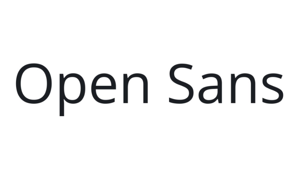
Open Sans (Bold/ExtraBold)
Open Sans is very simple and super easy to read. It fits perfectly into almost all niches. The letters stay completely clear even at smaller sizes. Sometimes, you might feel like other fonts just pack way too much personality for your specific video. When that happens, Open Sans becomes a great and safe fallback option.
-
Best for: Educational, corporate, explainer, and purely informational content.
-
Availability: Free on Google Fonts.
How to Add the Best Fonts to YouTube Thumbnails for High-Click Rate
You don't need complex, expensive design software to create thumbnails that compete with top creators. You can easily do it in minutes using Zawa. Zawa is a fantastic tool because it gives you instant access to rich text fonts that pop. Here is how to use it.
Step 1: Start a Blank Canvas
Head over to the Zawa homepage and locate the "Designer" section from the "AI Tools" dashboard. You will spot a button labeled "Blank canvas" right there. Click that button to kick off your brand new project.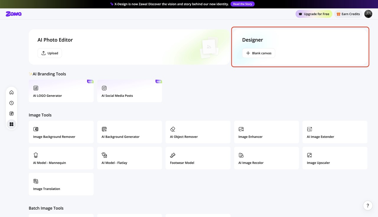
Step 2: Pick the YouTube Preset
Look under the specific "Social media" tab to find the format we need. Choose the "YouTube Thumbnails" option to lock in the perfect 1280 by 720 pixel dimensions.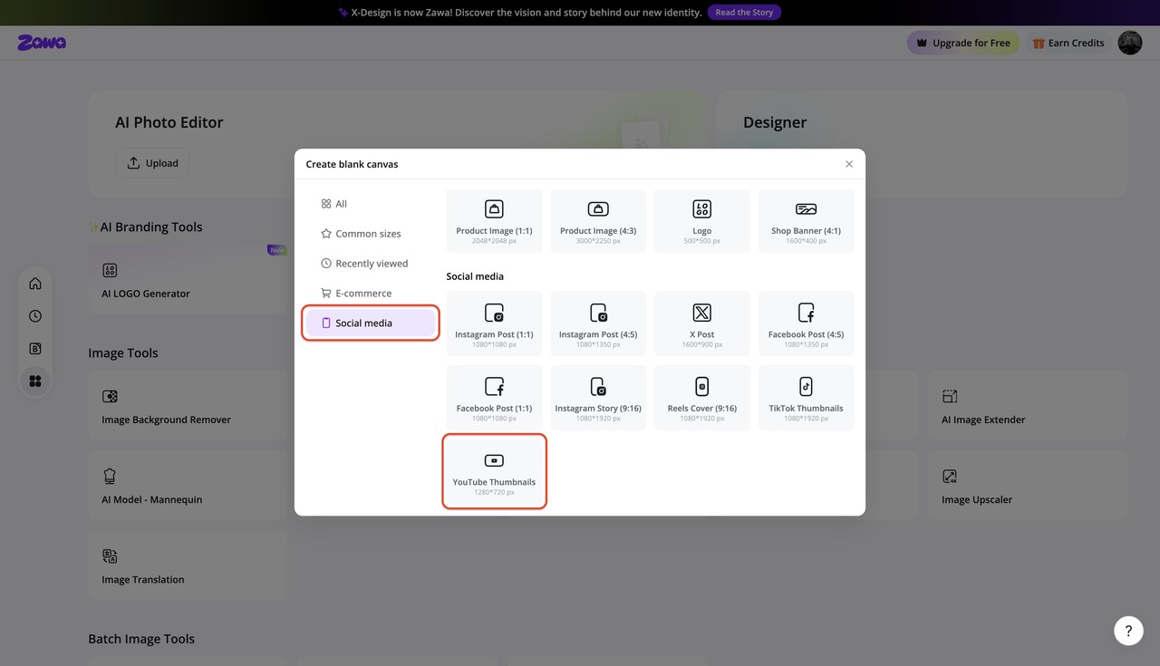
Step 3: Prepare Your Workspace
Notice the handy toolbars highlighted on the left and right that let you manage your canvas. Go ahead and use the side menu to bring in your background images to build a nice layout.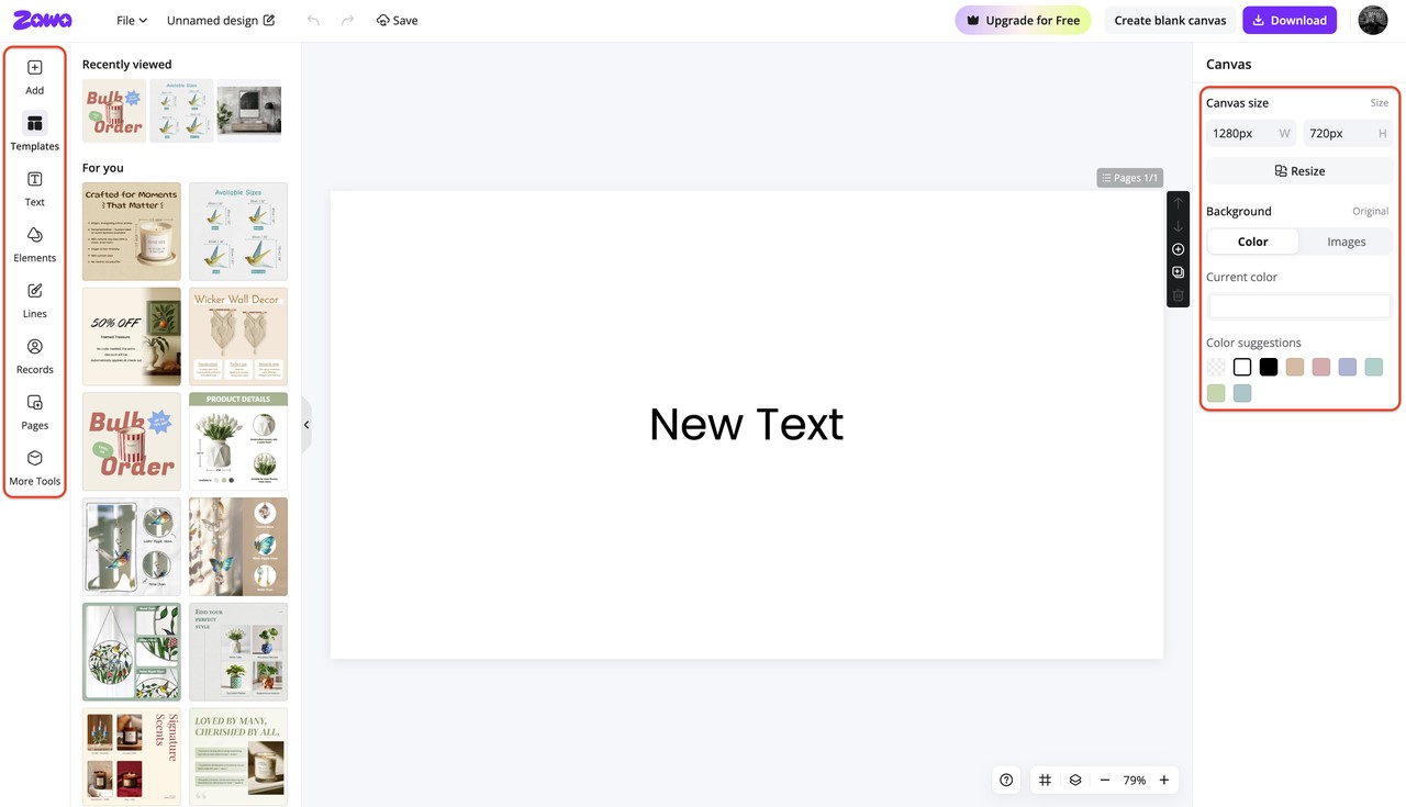
Step 4: Style Your Text Hook
Click the "Text" icon on the left menu to bring up your typing options. Type in a catchy, short phrase that tells viewers exactly what your video delivers. You can easily resize the text box by pulling its corners to make the words massive.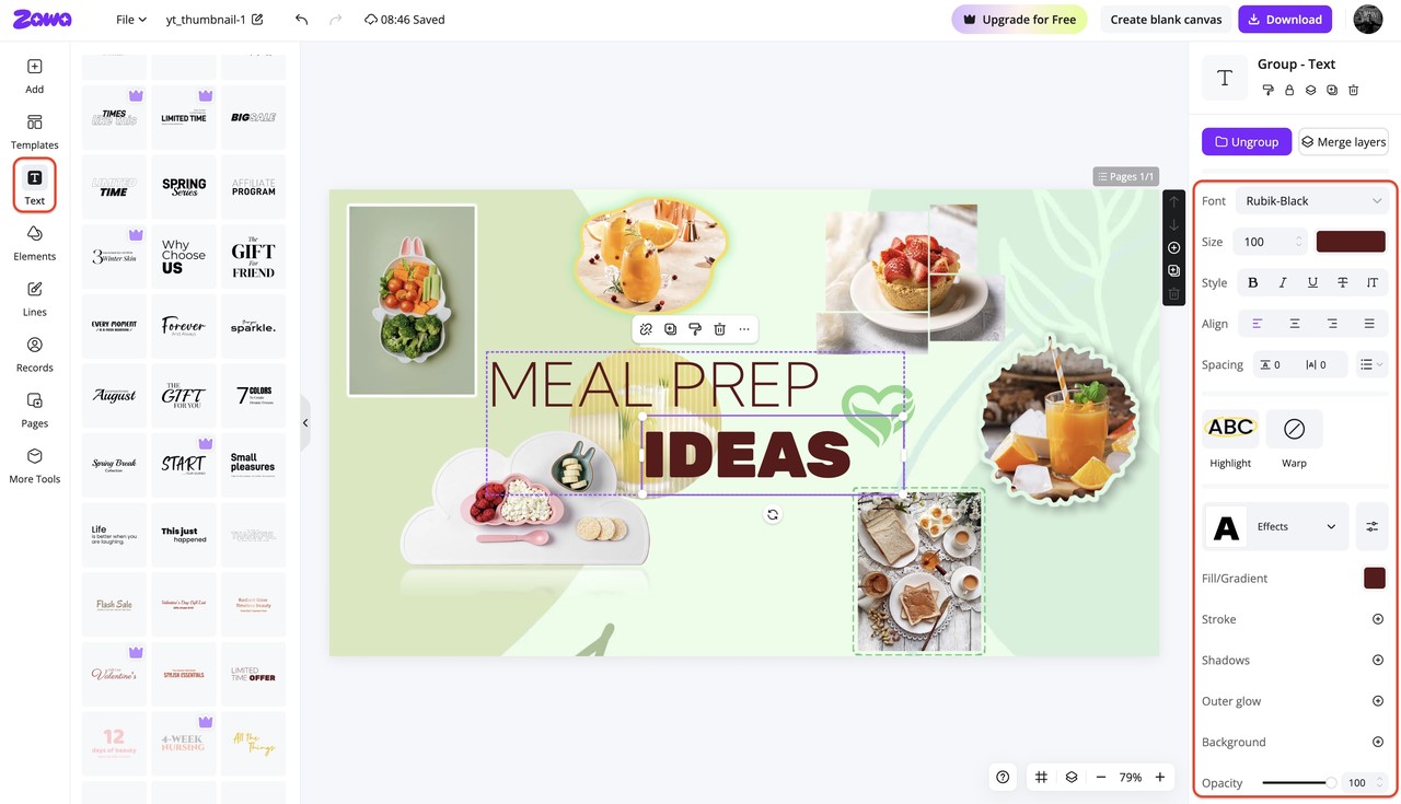
Step 5: Download the Final Design
Hit that purple "Download" button sitting up in the top right corner of your screen. Always choose the PNG format option because it keeps your image quality incredibly sharp for YouTube.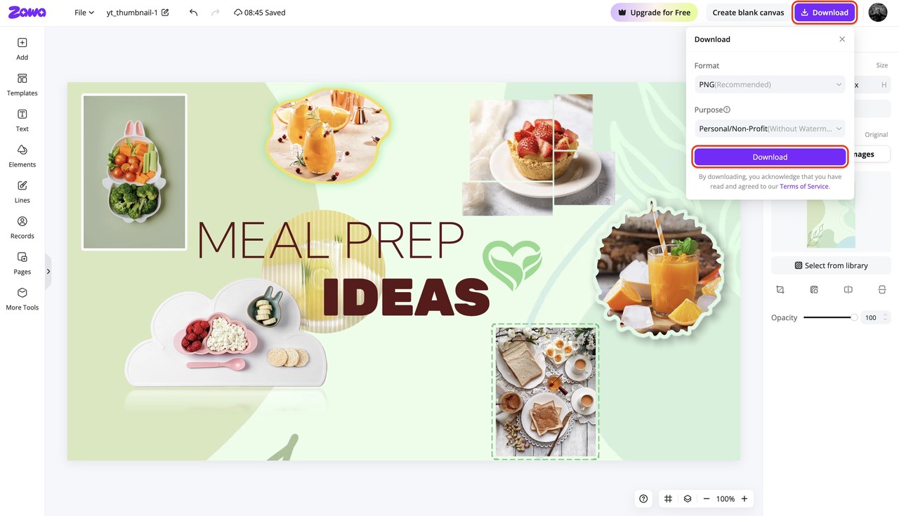
Pro Tips for Using the Best Fonts on YouTube Thumbnails
Now you know which fonts work best for your specific niche. But just picking the best font for YouTube thumbnails is not enough. How you actually style and size that text decides if a viewer clicks. Just picking a great font isn't enough; how you style, size, and position that text determines whether a viewer stops scrolling. The following are some proven design tips that will help you maximize your thumbnail's click-through rate. Have a quick look at the tips right away!
-
Limit your text strictly to 3 to 5 words. Viewers do not have time to read a paragraph. Keep your text short and punchy to ensure maximum impact.
-
Shrink your canvas to mobile size. Zoom out until your image is about 168x94 pixels on your screen. If you cannot read the text instantly at that size, you need to change the font or make it bigger.
-
Pair your fonts smartly. Use one bold display font (like Bebas Neue) for the main hook. Then, pair it with a clean, simple font (like Roboto) for any supporting words.
-
Add a 4–8px dark outline or heavy drop shadow. Thumbnails often have busy, colorful backgrounds. A dark outline lifts the text off the background and forces it to stand out.
-
Expand your letter spacing (kerning) slightly. When you use very thick fonts, the letters can easily blend together on small screens. Adding just a little bit of space between the letters makes the word much easier to read.
-
Place your text inside a solid-colored, angled box. If your background is too chaotic, put a solid yellow, red, or black rectangle behind your text. This creates ultimate background contrast.
-
Use bright text fills. Colors like bright yellow, cyan, or pure white pop nicely against both YouTube's dark mode and light mode backgrounds.
-
Position your typography on the left side. People who read English read from left to right. By placing your text on the left side of the image, you align with their natural reading habits. Plus, this keeps the text away from the timestamp YouTube places in the bottom right corner.
-
Set your primary font size to large. On a standard 1280x720 canvas, your main text should generally sit between 100 and 200 pixels in size.
-
Write a curiosity-driven phrase. Never repeat your exact video title in your thumbnail. Use the text to create curiosity or state an extreme reaction. The title gives the context; the thumbnail gives the hook.
Conclusion
Finding the best fonts for YouTube thumbnails is not just about making things look aesthetically pleasing. It is a calculated CTR strategy. The font you choose dictates whether a viewer clicks your video or scrolls right past it to your competitor. Remember the golden rule: bold, readable, niche-appropriate fonts are what stop the scroll. Always prioritize mobile legibility over fancy designs.
Finally, do not be afraid to experiment. Encourage yourself to try continuous A/B testing. Use YouTube's new thumbnail testing features to swap out different typography weights, colors, and layouts. Over time, you will find the absolute perfect visual formula for your channel's specific audience.
FAQs
-
Where can I get the best fonts for a YouTube thumbnail?
You can find hundreds of incredible, free options on Google Fonts. Websites like DaFont and FontSquirrel also offer great choices. Just make sure you check the license to ensure the font is free for commercial use before putting it on your channel.
-
How do fonts affect YouTube thumbnails?
Fonts affect thumbnails by controlling readability and setting the emotional tone. A bold, clear font catches the eye instantly, increasing your Click-Through Rate (CTR). The style of the font also tells the viewer what kind of video to expect (like a scary font for a horror game video).
-
Can I change the font color for a YouTube thumbnail?
Yes, absolutely! You should always change your font color to contrast with your background. White, bright yellow, and neon green are highly effective. Avoid dark colors like navy blue or dark red for the main text fill, as they fade into the background.
-
How to make a YouTube thumbnail with fonts online?
You can use browser-based design tools like Zawa, Canva, or Figma. These platforms allow you to upload your images, drag and drop text, apply outlines and shadows, and export your final thumbnail without needing to download heavy software.
You May Be Interested

Best YouTube Logo Makers
The Best Times to Post Reels on Instagram for Every Creator

10 Best Selling Items on Etsy: What to Sell and How to Stand Out in 2025
