Food Ad Examples That Drive Orders
Food ad examples show how strong imagery, clear offers, brand consistency, and direct CTAs turn attention into orders. Explore 10 campaigns, design tips, platform strategies, and common mistakes

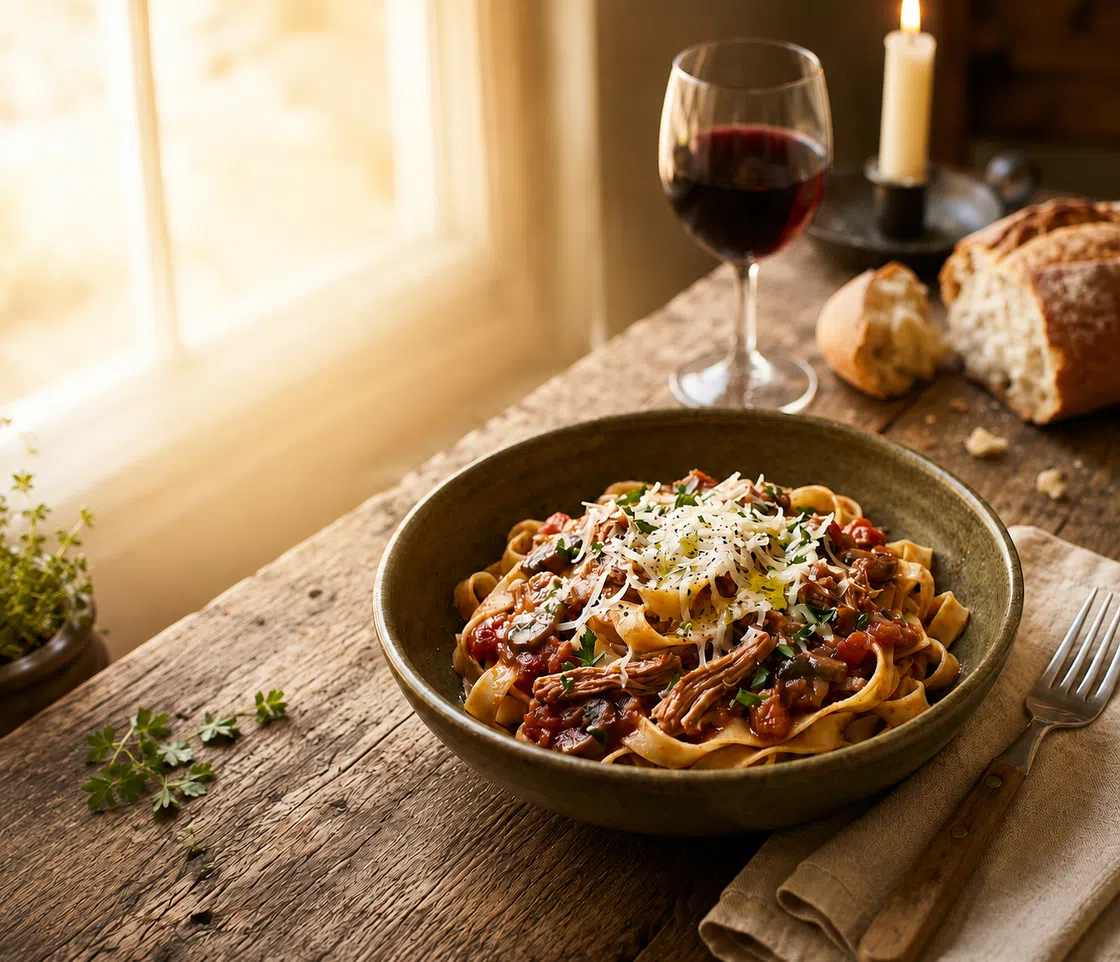
Explore practical food ad examples, creative ideas, and simple design tips that can help your ads stand out and drive more orders. This article analyzes 10 representative food advertising case studies. It also provides practical design methods covering food imagery, headlines, brand visuals, and platform optimization to help restaurants, food brands, and marketing teams create higher-converting ads.
What Makes a Food Ad Effective?
Effective food ads usually answer five questions at the same time: what is for sale, why it is worth trying, who the brand is, why consumers should act now, and what they need to do next. Even with limited space, these five pieces of information must follow a clear order of priority.
Appetizing Food Image
Make the food image the main visual element, giving it enough space to stand out before adding prices, headlines, or promotional details. Use close crops to show texture and freshness, but avoid cutting off key parts of the dish. Keep the background simple and leave clear space for copy, pricing, and the CTA. These elements should support the food image rather than compete with it, so the viewer notices the product first and the offer second.
Food images should not rely on oversaturation or over-sharpening. Keeping the natural texture, realistic sheen, and true portion size makes it easier for consumers to judge product freshness and taste.
Clear Headline and Message
A food advertisement poster should focus on one main message, such as a new product launch, a lunch special, a holiday limited-edition item, or a buy-one-get-one-half-off deal. The headline should explain the offer quickly, rather than sharing every product detail.
Main headlines should generally stay between 4 and 8 words. Even if consumers skip the fine print, the headline and main image should tell them exactly what the ad is promoting.
Offer, Discount, or Selling Point
Turn the main selling point into a clear visual element instead of leaving it inside a paragraph. For discounts, make the price or percentage one of the largest text elements and place the deadline in a smaller badge nearby, such as “20% Off” with “Ends Sunday.” Avoid vague labels like “Special Offer” that do not explain the actual benefit.
Product benefits can be presented in the same way. Use a short badge, stamp, or supporting label such as “30g Protein,” “Handmade Daily,” “Made With Italian Tomatoes,” or “Limited Summer Flavor.” Place it close to the food image so viewers immediately connect the claim with the product.
Keep one primary selling point per ad. The food image should attract attention first, while the price, benefit badge, and CTA guide the next step. Too many discounts, ingredient claims, and promotional labels on the same layout will weaken the visual hierarchy and make the ad harder to scan.
Brand Logo and Visual Identity
Brand identity means more than just placing a logo in the bottom right corner. The colors, fonts, photography style, packaging, backgrounds, and copywriting tone used in an ad should all come from the same brand visual system. For restaurants still defining that system, reviewing restaurant logo design ideas can provide direction for coordinating the logo, color palette, typography, and food imagery across campaigns.
If a consumer covers the logo and can still recognize McDonald’s by its red and yellow color palette, or think of Coca-Cola through red packaging and white fonts, it proves that the brand visuals have truly integrated into the ad content.
Strong Call to Action
The Call to Action should match the goal of the ad. Delivery ads can use Order Now, in-store events can use Visit Us This Weekend, and new product ads can use Try the New Flavor.
The details needed to complete the action should appear near the CTA, such as event dates, store addresses, QR codes, or purchase links. When consumers get an appetite but still do not know how to buy, the actual value of the ad drops immediately.
10 Best Food Ad Designs Worth Studying
The following case studies cover print ads, outdoor ads, packaging marketing, brand videos, and crisis communication. Their common thread is not just beautiful food close-ups, but their ability to turn abstract product selling points into visual evidence that consumers can understand at a glance. These campaigns can also provide poster design ideas for studying visual hierarchy, negative space, product focus, and brand recognition without copying the original execution.
McDonald’s — Santa
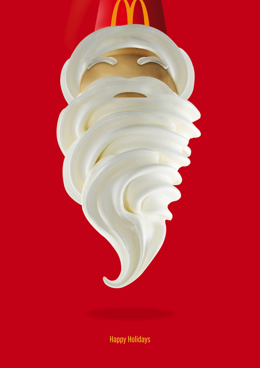
In its 2016 South Africa Christmas ad, McDonald’s used burger buns and white soft serve to form Santa Claus's face and beard against a signature brand-red background. The ad avoided complex Christmas trees, gifts, or snowy scenes, yet allowed consumers to recognize the holiday, the product, and the brand all at once.
This case study is perfect for researching festival foods advertisement. Holiday ads do not need to pack the frame with festive decorations. Instead, designers can look at the shape, color, and packaging of a product to find a natural connection with holiday symbols.
What designers can learn: Start with the product’s shape, color, texture, or packaging, then connect one of those features to a familiar holiday symbol. A strong visual association is often more memorable than filling the layout with seasonal decorations.
Burger King — The Moldy Whopper
In its 2020 The Moldy Whopper campaign, Burger King used time-lapse footage to show a Whopper decaying and growing mold over a month. The goal was to back up their claim that the product contains no artificial preservatives.
The ad broke the standard rule that food advertising must look appetizing. However, it achieved a more important goal by providing product proof. Brands should not simply copy this case study by making food look unappealing. The real lesson here is to identify the claim the brand needs to prove, and then find a visual way to demonstrate it directly.
What designers can learn: Start with the product’s shape, color, texture, or packaging, then connect one of those features to a familiar holiday symbol. A strong visual association is often more memorable than filling the layout with seasonal decorations.
KFC — FCK Apology Ad
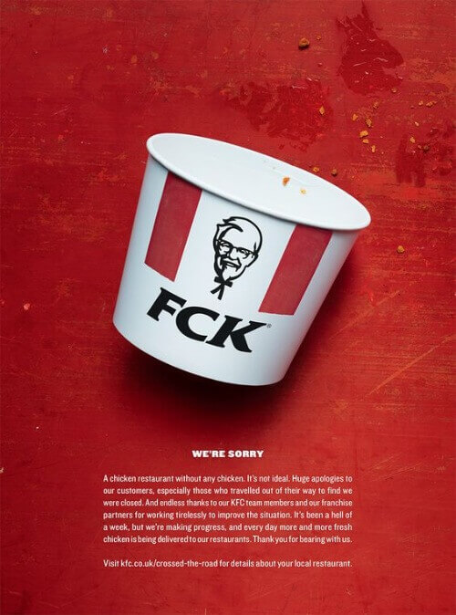
In 2018, some KFC locations in the UK temporarily ran out of chicken due to supply issues. The brand responded by running an ad showing an empty fried chicken bucket, rearranging KFC to FCK alongside a brief, direct apology.
The empty bucket explained the issue, the rearranged letters set the tone, and the familiar packaging maintained brand recognition. It proves that crisis ads should not pretend to be normal promotions. Acknowledging the problem clearly upfront usually wins more understanding than a lengthy corporate statement.
What designers can learn: In a crisis ad, use one instantly recognizable brand element and one clear visual symbol of the problem, then keep the supporting copy brief, honest, and easy to read.
Heinz — Pass the Heinz
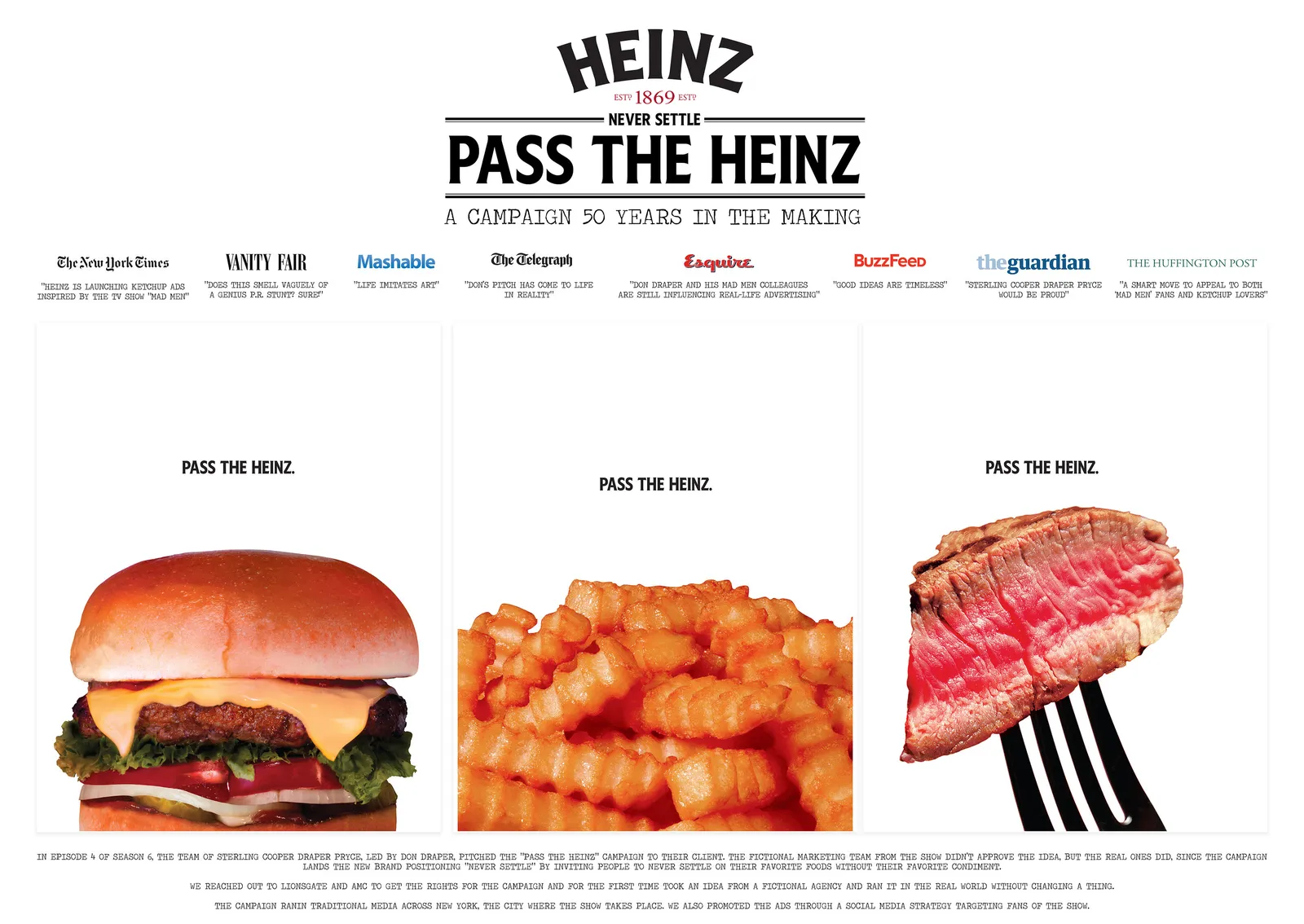
The Pass the Heinz campaign originated as a fictional creative pitch in the TV show Mad Men and was actually adopted by Heinz in 2017. The ads only displayed foods like fries, burgers, and steaks without showing the ketchup bottle, leaving just the copy Pass the Heinz in the frame.
The absence of the product actually made consumers realize what was missing from the scene. For brands that already have a strong connection to specific usage scenarios, showing a scene that feels incomplete without the product can sometimes be more engaging than just blowing up the packaging.
What designers can learn: When a product is strongly linked to a familiar food or eating occasion, consider showing the moment without it. The missing element can create curiosity and make the product’s role feel more essential than a standard packshot.
Coca-Cola — Share a Coke
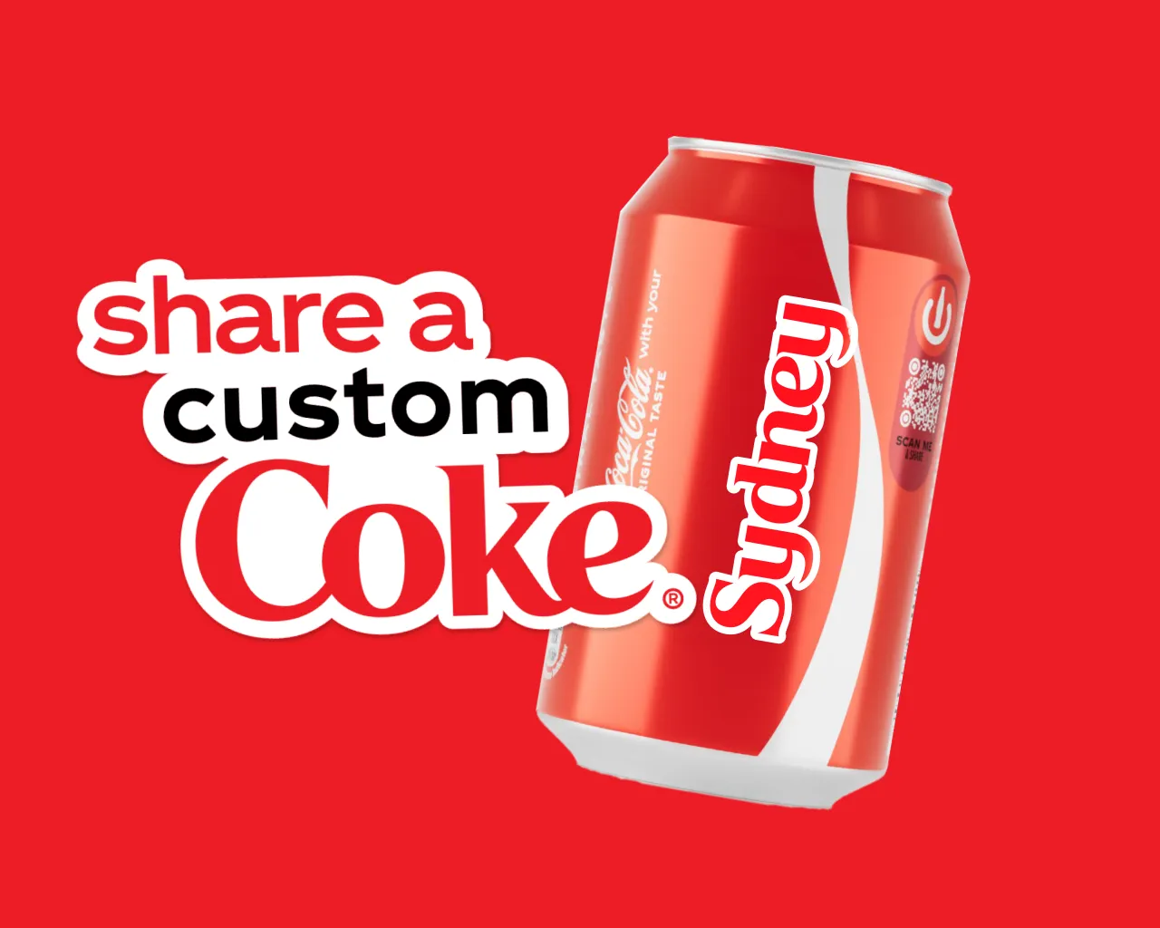
The Share a Coke campaign launched first in Australia in 2011, replacing the brand name on bottles with 150 popular first names. This swap turned a regular drink into a personalized item to find, gift, photograph, and share, eventually expanding to over 120 countries.
The key to its success was more than just printing names on packaging. It allowed consumers to see themselves or their friends in the product. Food brands can borrow this engagement strategy by using names, cities, holiday wishes, or personalized tags to drive social sharing.
What designers can learn: Build personalization directly into the packaging or ad layout through names, locations, holiday messages, or custom labels. Make the personalized element large and easy to spot so consumers immediately understand why the product feels relevant to them.
CookUnity — Real Food From Real Chefs
In its 2024 Real Food From Real Chefs campaign, CookUnity highlighted both actual chefs and full dishes at the same time. The campaign covered about 3,000 subway ad slots across New York and expanded into TV, search, social media, and direct mail.
Meal delivery services often face a trust issue where consumers wonder if the meals are just mass-produced pre-packaged food. By showcasing the chefs, dish details, and culinary credentials, the ads turned an invisible service advantage into concrete human and food proof.
What designers can learn: When the main selling point is expertise or authenticity, place the person behind the product directly beside the food. Use chef names, portraits, credentials, or preparation details as visual proof rather than relying on broad claims such as “chef-made” or “premium quality.”
Hummus Republic — Fresh Habits
In its 2023 Fresh Habits brand refresh, Hummus Republic created different buyer personas like Gym Junkie, Calorie Counter, and Plant-Based Eater to show how their menu fits various dietary habits.
Instead of making a generic claim that their food is for everyone, they helped specific consumers see a lifestyle similar to their own. The more defined the personas are in food advertising, the easier it is to understand the usage scenarios.
What designers can learn: Build each food ad around one clearly defined audience persona, then match the imagery, headline, nutrition information, and menu recommendation to that person’s priorities.
Pringles — Cheese
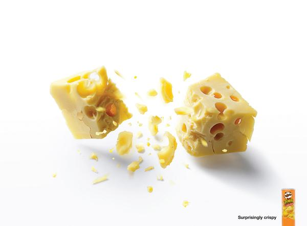
In its 2009 Cheese print ad, Pringles showed a piece of Swiss cheese snapping and sending out flying crumbs like a crispy object. By creating a cognitive conflict between soft cheese and a crunchy texture, the ad helped consumers understand the product's crunch quickly.
Texture does not have to rely only on descriptive words. Crumbs, a cheese pull, bubbles, steam, and flowing sauce can all serve as a visual language, allowing consumers to imagine the sound and feel of the food right from the image.
What designers can learn: Turn texture into a visible action by showing the food stretching, breaking, bubbling, dripping, or scattering, then keep the surrounding layout simple so the texture cue becomes the main message.
Lurpak — Game On, Cooks
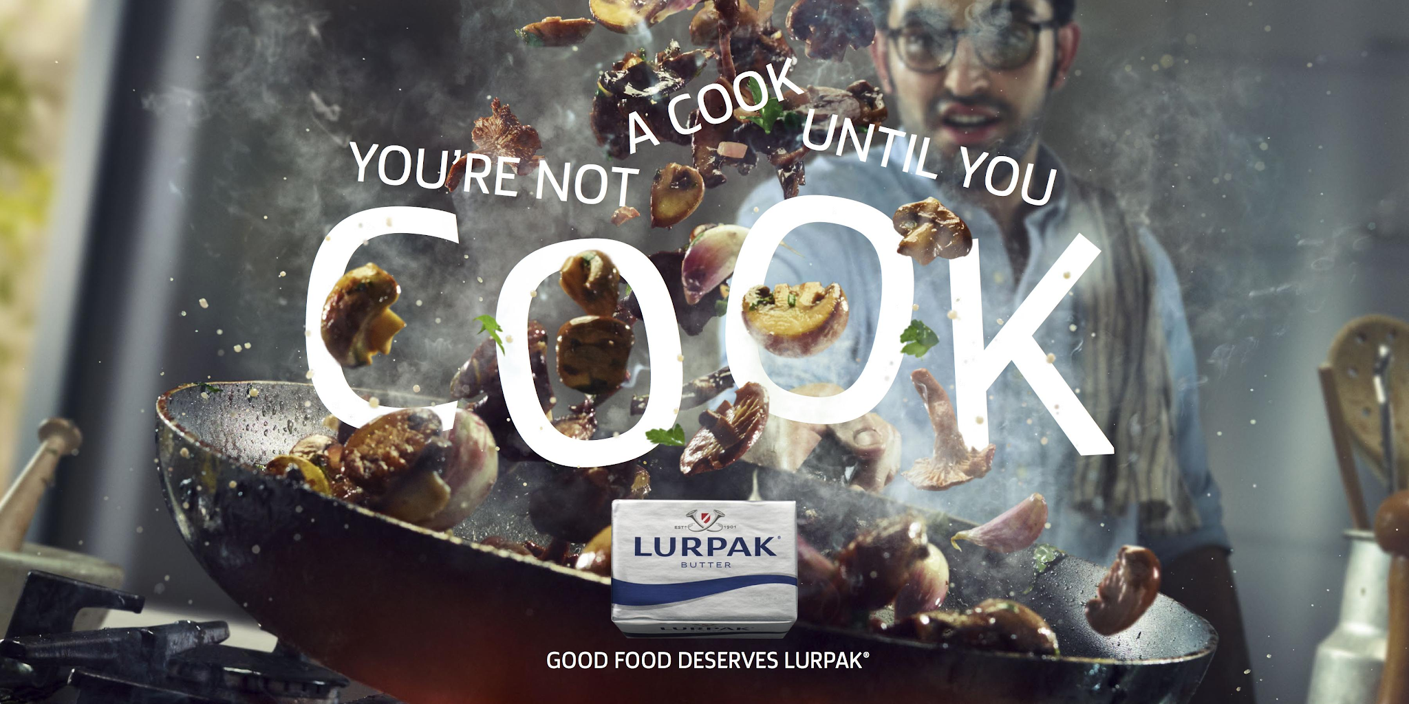
Lurpak launched Game On, Cooks in the UK in 2016. The campaign targeted the trend of people watching more cooking shows while actually cooking less, encouraging viewers to turn off their screens and start cooking. The video used fast cuts, food prep shots, and high-intensity actions to show the real cooking process.
Instead of keeping the butter packaging static in the center of the frame, the ad showed the product in action through frying, baking, mixing, and seasoning. For sauces, spices, and ingredients, showing how the product transforms a dish is usually more convincing than just showing the package by itself.
What designers can learn: For sauces, spices, butter, and other cooking ingredients, show the product being poured, spread, melted, mixed, or added to a dish. The ad should make the product’s role in the final result visible instead of relying only on a static package shot.
Ocean’s — Bear Approved
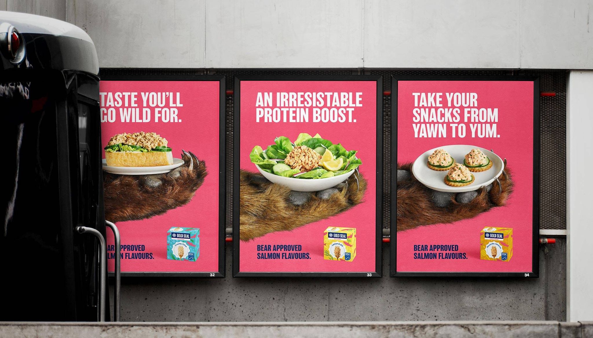
In its 2025 Canada Bear Approved campaign, Ocean’s used a custom bear paw reaching for a ready-to-eat salmon bowl, paired with bright brand colors and short copy. Since consumers immediately associate bears with a love for salmon, the visual required no extra explanation.
This case study shows that ad characters do not always need a full backstory. As long as the character has a clear relationship with the ingredient, a single partial action can build humor, product association, and a strong memory point.
What designers can learn: Choose a character with an instantly recognizable connection to the food, then use one simple action, such as reaching, tasting, or protecting the product, to communicate the idea without adding unnecessary copy.
Food Ad Design Tips That Make Food Look More Clickable
Food ads need to catch attention first, then help consumers understand the product and take action. The following methods apply to menus, delivery platforms, in-store posters, social media ads, and holiday promotional materials.
Make the Food the Main Visual Focus
First, identify the single hero of the ad. The main dish should take up the primary visual space, while utensils, packaging, people, and decorative elements support the scene rather than competing with the product for attention.
Use High-Quality and Appetizing Food Images
Blurry, dark, or gray-toned photos make it hard for consumers to judge food freshness and texture. When editing, focus first on exposure, clarity, white balance, and background distractions instead of just boosting saturation.If a strong food photo is too small for a poster or delivery listing, understanding how to upscale images without losing quality is useful when preparing larger files without softening important textures.
When original images come from a phone or onsite shooting conditions are limited, you can use Zawa to improve image clarity, remove unwanted objects, and generate natural backgrounds to create social media flyers, menus, and food advertisement posters.
Keep the Message Short and Easy to Read
Food ads can build three information layers. The first layer is the product or event name, the second is the price, flavor, or core selling point, and the third is the date, address, and how to buy.
When the copy does not fit, you should cut details that will not change a buying decision instead of shrinking the font size. Brand history, full ingredient lists, and detailed terms can live on a landing page, a menu, or behind a QR code.
Use Color, Contrast, and Typography Carefully
The role of the background color is to make the food stand out, not just to look bright. Light-colored desserts work well with darker backgrounds, while dark roasted meats look best against light or neutral backdrops. Green salads should avoid blending into a background of a similar color.
An ad rarely needs more than two fonts. Use a distinct, recognizable font for the headline, and keep a clean, readable font for prices, dates, and the CTA.
Add Emotion, Urgency, or Appetite Appeal
Food ads can build a reason to act through scenario, timing, and texture. For example, Warm Cookies for Rainy Evenings highlights an emotional scenario, Available This Weekend creates a real-time limit, and Crispy Outside, Juicy Inside directly stimulates texture imagination.
The urgency must be real. Repeatedly using Last Day or fake countdowns might boost a single click, but it lowers consumer trust in future brand promotions.
Common Food Ad Design Mistakes to Avoid
Poor food ad performance rarely stems from a lack of design complexity, but rather from a single frame taking on too many tasks. Before launching an ad, you should clarify whether its primary goal is to introduce a new product, build the brand, promote an offer, or drive immediate orders.
Using Blurry or Dark Food Photos
Low resolution hides ingredient textures, while dark shadows can make meat, bread, and sauces look unfresh. Instead of adding more copy to explain the product, focus first on fixing image exposure, focus, and subject separation.
Adding Too Much Text
Jamming menu descriptions, brand history, offer rules, ingredients, and store info all onto the same screen turns an ad into a user manual. An ad should focus on building interest, while the finer details belong on the menu, product page, or landing page.
Making the Offer Hard to Find
Consumers should not have to hunt for prices and discounts in decorative fonts or image corners. Keep promotional numbers, combo details, and deadlines in a dedicated zone near the CTA.
Ignoring Brand Consistency
Using completely different colors, fonts, and photography styles for every campaign forces a brand to constantly reintroduce itself. Holiday ads can change up decorations and themes, but the logo, core colors, product photography style, and copywriting tone should stay consistent.
Designing One Ad for Every Platform
Outdoor ads need long-range recognition, social media ads need to grab attention during a fast scroll, and short-form video ads must show the product or results as early as possible. Simply shrinking or cropping the same landscape design for every platform can easily result in tiny headlines, lost focal points, and blocked CTAs.Format choice matters as much as resizing. A poster vs flyer comparison can help determine whether a campaign needs long-range visual impact or more room for prices, dates, and ordering details.
Use the following checklist before publishing:
1. The main food item remains clear on a phone screen.
2. The headline can be read within three seconds.
3. The promotional amount and deadline are easy to find.
4. The logo does not block the food, nor is it too small to recognize.
5. The area near the CTA contains the details needed to complete the action.
6. Different platform versions maintain the same brand visuals.
7. The food imagery looks real, without excessive editing or wrong ingredients.
Conclusion
Great food ads do not rely on a fixed style. Instead, they turn seeing food into wanting to try it by using a clear food subject, believable textures, concrete selling points, and a straightforward path to action. When studying classic cases, you should look beyond just copying their color schemes or compositions. Instead, analyze how each ad translates product features into visual proof that consumers can understand at a glance.
FAQ
How can advertising influence your food choices?
Food ads can influence choices through repeated exposure, visual stimuli, offers, relatable scenarios, and brand memory. When consumers get ready to buy drinks, snacks, or takeout, brands they have seen recently and can easily recall are usually more likely to make the shortlist.
This impact is especially notable among younger consumers.
What techniques are used in food advertising?
Common techniques include food close-ups, steam, slow motion, crunchy sounds, cheese pulls, flowing sauce, limited-time offers, price comparisons, human reactions, holiday scenes, and personalized packaging.
Effective ads usually pick only two or three techniques that best fit the product. For example, potato chips work well when emphasizing crunching and sounds.
What are some examples of food advertising?
Food ads include new product posters, delivery ads, menu visuals, packaging marketing, holiday campaigns, outdoor ads, and brand videos.
McDonald’s Santa belongs to festival foods advertisement, Heinz Pass the Heinz falls under minimalist print ads, Coca-Cola Share a Coke uses packaging to drive sharing, and CookUnity explains its service value through chefs and complete dishes.
What is a good slogan for food?
A good food slogan should be short, specific, and tied to the product's texture, scenario, or key benefit. For example, Freshly Baked Every Morning highlights freshness, Big Flavor in Every Bite emphasizes taste, and Dinner Ready in 10 Minutes focuses on convenience.
While phrases like Best Food or Delicious Taste are easy to understand, they lack specific details. Before picking a slogan, first determine whether you want consumers to remember your brand for freshness, speed, taste, health, or price.
What are the latest food marketing trends?
Food marketing is shifting from single polished images to more authentic, engaging content built for multi-platform reach. Common trends include cooking processes in short videos, chefs and creators on camera, personalized packaging, QR code interactions, user-generated content, and using AI to quickly create different sizes and language versions.
You May Be Interested
133 Independence Day Captions for Social Media

1440p vs 4K: Key Differences, Real Scenarios & Blur Fix

What Is 1440p Resolution? QHD Explained (2026)

150+ Instagram Bio Ideas to Catch Eyes at a Glance in 2026
165 Father’s Day Card Messages & Ideas